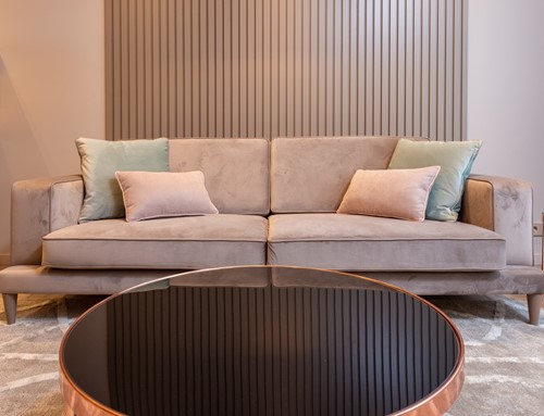
Balance and symmetry are essential elements of interior design. Everything from the arrangement of furniture to the art on the walls can affect the symmetrical balance of the space and create entirely different aesthetics. Here is a basic guide to the different types of symmetry and balance commonly used in interior design:
Symmetrical balance is the most popular variety used by designers. It's also the easiest to achieve, whether you're working horizontally or vertically. Symmetrical balance is common in square and rectangular-shaped spaces and is a hallmark of traditional design styles.
A simple example would be two chairs separated by an accent table, or two sofas with a coffee table in between. Formal dining rooms are a perfect way to explore symmetrical balance, especially when working with architectural characteristics like windows.
Asymmetrical balance is more difficult to achieve but can make a dynamic impact. When using asymmetrical balance in interior design, the results are usually more casual. Not only does this make it a popular option for small, narrow or oddly shaped rooms, but it also lends itself to a wider variety of “informal” design styles.
An example of asymmetrical balance might be arranging heavier, larger furniture pieces all together on one side of the room, and the smaller, lighter pieces on the other. To make the room feel balanced, designers incorporate bold colors, patterns or additional decor to the lighter side.
Radial balance is often blended with both symmetrical and asymmetrical balance to add round pieces harmoniously into designs. A basic description would be objects rotated to face the same direction around one central point.
For example, a round dining table with an odd number of chairs would exhibit radial balance rather than symmetrical. Spiral staircases, round kitchen islands and circular windows on walls or front doors are other examples of radial balance in context.